
- Improving your website forms
- Improving your website checkout and account creation steps
- Improving other interactive parts of your website
Even for a small website, usability is extremely important. If you’ve ever seen enough qualitative feedback or quantitative data on how people use actual websites you’ll see that nothing is too obvious that it doesn’t need to be spelled out and nothing is so simple that everyone will figure it out. Some people are not tech-savvy and even those that are tend to often be distracted. Meaning no matter who you’re targeting, unless your website is an online graded exam you’re not reaching people in their highest level of concentration.
Usability can mean the difference between a conversion rate of 10% and 0%. There are many aspects to usability, we’ll cover the top few. Also see chapter 10 for navigation, since that also forms a large part of it.
Forms
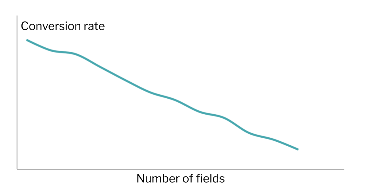
A good form strikes a balance between the information you’re trying to gather and maintaining a quick and easy experience by the user. You can think of it as a tug of war. From the product or sales side, you might want as many form fields as possible to gather good data and to be able to serve the user. From the marketing side, you might want as few fields as possible so that people actually complete the damn thing. Here are some ways to strike the balance.
- For each field, ask yourself what would happen if you didn’t ask for this information at this step? For example if a lead form contains a phone number field but the user goes into an email outreach system, having the phone number there is probably just reducing conversion rates.
- On the other hand, you might want to reduce the conversion rate if you’re getting too many form submissions that are low quality, so there can be a case for adding fields to filter out the more casual users. Either way you should be clear with what you’re doing, every new field will generally improve submission quality and reduce the conversion rate.

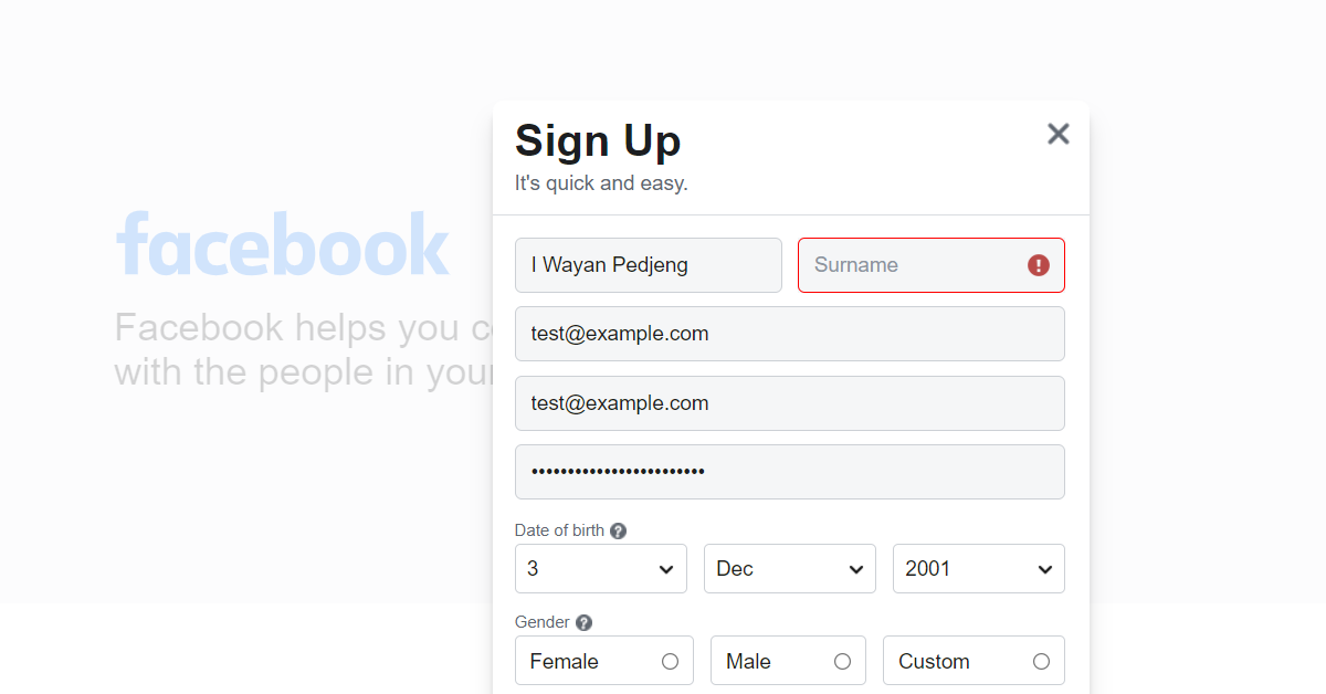
- When a user submits a form, they’ve already spent time on it so it creates a lot of friction to be sent back to the form to add fields. Make it clear which fields are required and which are optional. Yes people generally understand that an asterisk (*) next to a field means it’s required but being more explicit than this is better.
- It’s also good to provide feedback about where in the form the user is on, for example by highlighting the active field slightly. This means validating fields as users complete them.
- Modern browsers are also much better at validating fields as the user types. For example it’s much better to mark up a phone field to only allow users to type in an Australian mobile in the format 0000-000-000 (yes it is possible!) than to let the user submit the form and have it knocked back.
It’s also important to consider the context and assumptions around some of the fields you might be asking for. For example
- Do you really need to collect gender from the user? If you do, just having Male/Female will not do; you need to think harder about this. If this makes you think it’s too much work and you can drop this field altogether that might be a sign that it’s best to do this.
- Same for titles; just having Mr, Miss, Ms is not appropriate and will alienate some people.
- What about user location? Even if you generally serve domestic customers, think about other cases. Someone might be overseas, or someone overseas might be buying a gift for someone in your local area.
- Names are also notoriously difficult to get right. If you make first name and surname compulsory this assumes that all people have 2 names (not true) and that they have a surname (not true). Check out the timeless article Falsehoods Programmers Believe About Names.
Account creation/management
- The most important question is whether account creation is even needed. It’s now much less common for ecommerce platforms to require registration (with login and password) in order to buy something but it does happen. If you do this it would ideally be at the end and incentivised by you making it clear why someone would do this. For most ecommerce websites it’s not something to put front and centre.
- If you do have a login or account creation process though, consider adding single sign-on (SSO) options where people can create an account using their Google, Microsoft, Facebook etc. logins. Usually this can be done with just 1 or 2 clicks by the user now which is much better usability than most signup/login forms (although you do need to consider the privacy implications). And if you just need someone’s email address you may not need to connect further data. Just make sure you still offer a traditional signup/login option (username and password) for those who aren’t on social media.
Checkouts
- How many times have you gone through the whole process only to abandon because the shipping fees were much higher than you expected/were prepared to pay? In those cases it’s best to have these upfront, eg. a shipping calculator on the product page. However, given that people are psychologically allergic to shipping fees, by incorporating the price of shipping into the product itself you may see a higher conversion rate anyway.
- Similarly, you may need to recoup some credit card/PayPal fees in your checkout but by golly you had better make sure that’s very clear on the page before they complete their payment. If someone’s buying say a laptop and the credit card fee will add around $20 to their purchase that will be hard for your brand to recover from.
- It’s also useful to let people adjust products right on the checkout page itself, which can lead to some upsells.
Other content types
- People are more used to downloading PDFs and other files when clicking on a link, but it’s still good practice to warn them especially since on a phone it may take them out of their browser automatically.
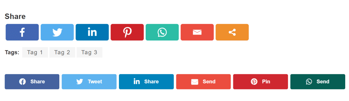
- Your favourite social sharing widget might be nice but people browsing on their phones generally use their phone’s native share functionality. And yes they sometimes need a nudge. But many social widgets are very aggressive, for example being sticky at the bottom of the screen. Unless you’re primarily a content website, this kind of real estate is best reserved for meatier calls to action like chat, call, get a quote or enquire.
Pick any form on your website and fill this out for each field:

