- Why you need a general analytics tool
- The need to plan for an analytics setup
- Avoiding common pitfalls when interpreting your reports
Why do you need a general analytics tool?
Most platforms have their own reporting, which often comes out of the box. For example:
- Website builders and CMSes might have their own reporting (eg. Shopify reports).
- CRM and email platforms will also report on that channel (eg. Mailchimp reports).
- Same for ad platforms like Google ads,Facebook ads etc.
- Same for plugins and widgets like popups, form builders like Unbounce.
It’s tempting to rely on those platforms and for some questions you probably need to. However for almost all websites it’s definitely worth investing in a holistic analytics tool like Google Analytics, Matomo, Clicky, Adobe Analytics and so on. Here’s why:
1. Most of the individual platform tools are only concerned with their own area of purview. This makes sense but can potentially be misleading. Maybe most of your customers click on both your Google and Facebook ads before they convert. This means each individual advertising tool would report a conversion for each person and you would be double-counting or at least have a misconception about how these contribute to the conversion path. (For example if you know people typically click on the Facebook ad first this might impact your website and ad strategy.)
Gathering this data in one place lets you reduce the double-up and start comparing apples with apples.

2. Most non-holistic tools don’t get granular enough for you to get insights easily. The simplest case is a single metric, for example the conversion rate of your newsletter popup. The platform’s analytics tells you it has a 0.5% conversion rate (or out of every 200 people who saw it, 1 completed it). But so what? Does this tell you how to improve the form? Are people starting to fill out the popup and then changing their mind or are they closing it straight away? Does it differ based on traffic source? Would you even expect a first-time visitor who came from Google search results to subscribe to your newsletter and if not would the conversion rate be very different for repeat, non-Google visitors?
Most tools do let you break your data down. For example an email tool will typically have breakdowns by individual email, by user segment etc. But it’s rarely got the levels of freedom that a generic analytics tool will have. A key task for improving your website is to ask very specific questions about your user behaviour, tailored to your website only, getting answers and making improvements. For this, a generic analytics tool will really help out.
Setting up a generic analytics tool is rarely instant!
Let’s say you’ve decided to use a generic analytics tool. Great. It doesn’t know about your business or what’s relevant. Most of the time it gets you to add a basic tracking code to the website but that’s rarely going to give you the most meaningful data for your website. We’ll use Google Analytics as an example since most of the time that’s what people choose. Here’s a summary of what is measured with the new default tracking code for Google Analytics 4:
- User-level data for device, location, traffic source, visit count.
- Page-level data for URL, page title.
- Views of a page (pageviews).
- Scrolls to 90% of the page.
- Clicks on outbound links or file links (with the relevant data).
- Website searches (with the search keywords).
- Interactions with embedded YouTube videos (with the relevant data).
This is a lot more than the old version of Google Analytics but a lot of the most important pieces still need setting up. For example:
- Labelling inbound traffic correctly in reports through campaign tagging.
- Demographic data.
- Events corresponding to lead-like actions (eg. clicking on an email or call link).
- Events corresponding to lead generation (eg. completion of contact or newsletter forms).
- Events corresponding to ecommerce actions (eg. purchase/donate).
- Any custom data such as your own CRM ID (for measuring offline conversions).
To use an analytics tool, you need to know what’s converting and what’s not and for this you will need to track events that correspond to these conversions. The above is not an exhaustive list but is an overview in ascending difficulty. Many websites might not need #5 but if you’re not tracking #3 and #4 you won’t know what’s happening on your website.
Most people draw the wrong conclusions from their analytics data
Whatever your setup, it’s easy to get misled by reports. Here are some things we see leading people astray:
- Looking for complete accuracy rather than trends: No analytics tool will perfectly capture each interaction. Some people will have ad blockers that might prevent tags from firing, others might close the page before a thankyou message loads and so on. Yes you would usually want your analytics data to be around 90% of your real numbers (eg. from your payments processor). If it’s something like 50% that’s a problem. But don’t aim for 100%, it won’t happen and it will waste valuable time that you could spend looking at existing data. Think of your analytics reports as a useful sample of your website traffic. What’s it telling you?
- Top/popular pages: This does give you a good top-line overview of your content but a lot of the times we see it framed as a question of user choice, ie. “which pages on my website are people choosing to go to?”. But this merges 2 separate scenarios. If that page was a landing page this means that someone clicked through to it from outside your website, in which case the choice of page has more to do with your marketing than user choice (of course people do share links themselves and for search keywords user intent is still primary, but most of the time the page is selected). If on the other hand the page was not a landing page, the user must have navigated to it from a previous page of your website. In which case, that often has more to do with your nav menu, how the previous page presented links/buttons etc, and still might not be about user choice. The main question a top pages report should prompt is “can I shape the user flow better?”.
- Bounce rate: People obsess about bounce rate which is why we were glad to see it go in the latest iteration of Google Analytics (GA4). Most websites have just the basic tracking code, which means something counts as a bounce if someone visited one page and did not visit another. Did they read it with enthrallment for 15 minutes? Did they get what they need from that page (eg. a contact us page) and that’s why they left? Without more context, you don’t know. Certainly if a key page has a very high bounce rate that’s a reason to investigate but by itself it doesn’t mean much. A better question is: “what is the key purpose of this page and what percentage of people who see it end up fulfilling it”?
- Average time on page / average session duration etc: This metric is difficult to measure and analytics tools often have a hard time coming up with something meaningful. For example if a tab is open for 2 hours does this mean a user was focussed on your website for 2 hours? Almost certainly not. The best measure is probably the amount of time that your website was in focus, but few tools measure this (Google Analytics 4 does) and this is different to older, less meaningful metrics like “time on page”.
- Exit pages / exit rates: Another thing that’s often measured but easy to blow out of proportion. Unless you’ve trapped a visitor inside your website they will eventually leave. The number of exits is equal to the number of entries and the vast majority of the time your top exit pages will be your top entry pages too. Again, not that you can’t draw insights from these but we’d recommend you put this type of analysis towards the bottom of your list.
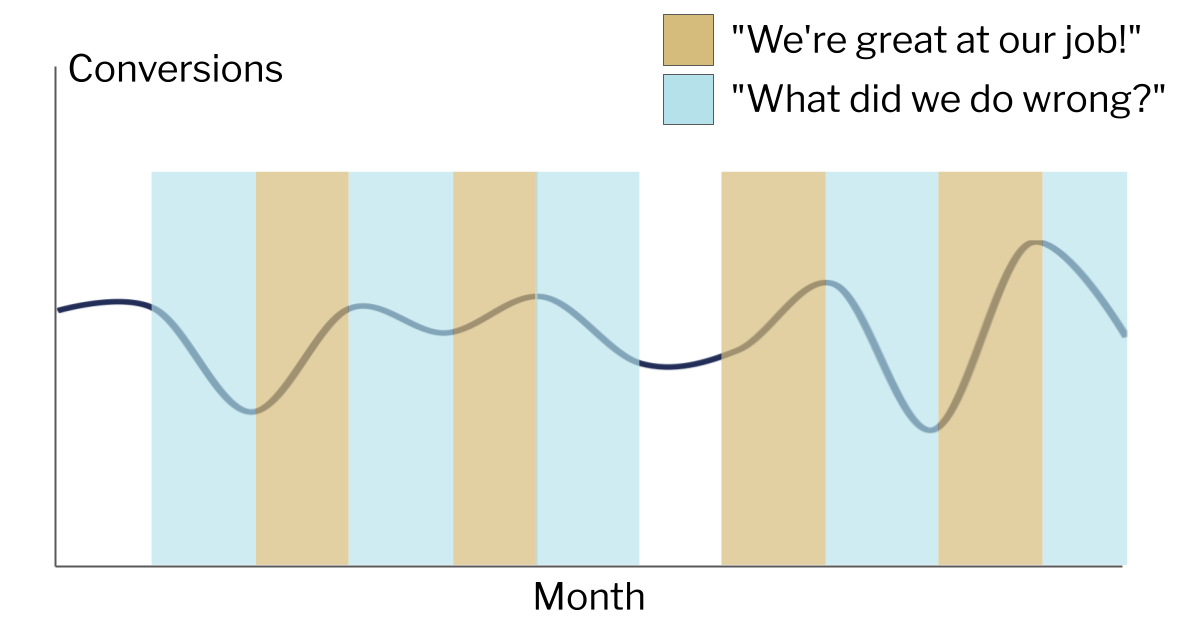
- Trendlines: Comparing performance can be very useful. Did we get more traffic this week than last week? Did we get more conversions last quarter compared to the same quarter last year? However, be wary of being put into a position where this sets up an expectation of constant growth and improvement. That’s not how any website works, even if everything’s going right. With this expectation, it becomes tempting to try to find reasons for changes even in statistical noise. The end result can be a sad state of constantly reading tea leaves, being institutionally expected to take credit for any positive change and find the cause/blame for every negative change.

Getting to the right conclusions is harder, but is possible
Like most things to do with websites, there’s no end to how sophisticated you can get but below is a framework that we think can be used for most websites and skill levels.
- Define your goals/KPIs: What are the main things you want to achieve? You should be tracking this to score your traffic across each objective. These objectives can be at website level (eg. complete the enquiry form) or at page level (for the homepage, click the “Enquire” button).
- Look at the overall metrics: For example, at the website level you might want to see how many users/visitors you had, how many times the contact form was completed and the conversion rate (ie. one divided by the other). You should also check trendlines over time but the most important thing is to not stop here.
- Look at breakdowns: Even if your website has just one objective (eg. contact form), you can still see a breakdown of the form completion rate by factors such as: (A) device category (B) traffic source/channel (C) landing page (D) geographic location (E) first visit vs repeat visit.
- Identify outliers: Once you see your overall success metrics broken out like that, you will see outliers. Not all landing pages or channels or keywords will perform the same. Identify those that perform much better/worse than the site average. Note that for a low traffic website you’ll need to be careful about making inferences from too small a dataset. You will want to focus on outliers with rows that represent your biggest share of traffic first.
- Form a hypothesis: Let’s say when you break down by device type you notice that mobile traffic completes the contact form at a higher rate than desktop. There might be lots of explanations for this, you will need to add your own context. In this case I’d check the page on desktop and mobile; maybe on desktop the contact form is in a 2nd column that’s not as prominent.
- Test the hypothesis: If the hypothesis is correct then updating the form on desktop would fix it. In chapter 19 we’ll look at A/B testing but in this case you could potentially just make the change if you think the risk of making things worse is low. The main part is to be accountable to yourself. You are expecting a specific effect: an increase in conversion rate on desktop devices only, within a specific timeframe. Did it happen or not?
- Repeat: it never stops!


